Free extension for sports fans
Advertisement
Advertisement

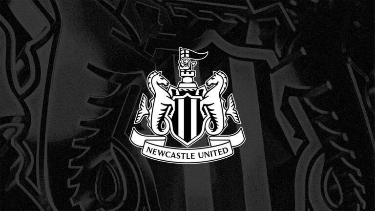
The ‘new’ Newcastle United crest, Hippocampi and they are not Seahorses!

Oh no they’ve changed the Newcastle United crest. The very depiction of the essence of the club, intrinsically linked with the city as evidenced by the usurped crest being an...You can click here to read the full article.

Published: Wednesday, 7 October 2026 at 11:27 AM
The ‘new’ Newcastle United crest, Hippocampi and they are not Seahorses!
Key Things to Know
  • The writer analyzes Newcastle United's subtly updated crest following two years of fan consultations.
  • The crest adjustments were made primarily to improve clarity and resolution across digital media.
  • The writer notes the castle and lion look sharper but argues the redesigned hippocampi look worse.
The Story in 60 Seconds

Newcastle United has slightly tweaked its official club crest following two years of supporter consultations, primarily to enhance digital resolution. The update brings sharpened definition to the castle, lion, and the flanking hippocampi, though the overall design remains largely familiar at first glance.

Writing for NUFC The Mag, the author supports keeping the coat-of-arms design despite disliking the revised look of the hippocampi. The writer argues against adopting retro badge alternatives as primary crests, noting they represent bleak historical eras.


Advertisement

Never Miss a Sports Update

Get the latest sports news and top stories from MySportsTab delivered straight to your inbox.

No spam. Just the latest sports news and updates.